
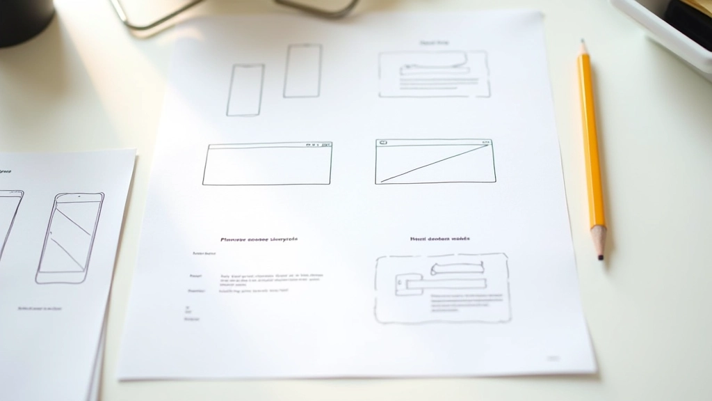
Understanding the Problem
Split-screen layouts look stunning on desktop. You’ve got a clean 50/50 division—image on one side, text on the other. But here’s the thing: that same layout on a phone becomes a useless horizontal squeeze. Text becomes unreadable. Images shrink to nothing.
The challenge isn’t just making it fit. It’s deciding what happens to that beautiful symmetry when the viewport gets small. Do you stack vertically? Which column comes first? How do you preserve the design intent while respecting mobile constraints?
We’re going to solve this properly. Not with generic breakpoints, but with a thoughtful approach to mobile-first responsive design.


Your Breakpoint Strategy
Most people use 768px as their mobile-to-tablet threshold. That works fine if you’re thinking about generic responsive behavior. But for split-screens, you need to think differently.
Your breakpoint isn’t arbitrary. It’s based on when your 50/50 layout stops working. If your content needs 480px to display properly on one side, then your split-screen isn’t functional below 960px. Set your breakpoint there.
Pro tip: Don’t fight the browser. Use Chrome DevTools to test your exact breakpoint. Drag the viewport smaller until your layout starts looking cramped, then set that width as your breakpoint.
The Content Order Question
When your split-screen collapses to a single column, which element appears first? This matters more than you’d think. It affects how users experience the content, especially on mobile where scrolling behavior is everything.
If you’ve got an image on the right side at desktop, don’t automatically put it second on mobile. Ask yourself: what does the user need to see first? Is it the headline and context? Or does the visual lead the story?
CSS Flexbox gives you the answer. Use
flex-direction
to rearrange content without touching your HTML. Desktop gets
flex-direction: row
, mobile gets
flex-direction: column
. The order stays intelligent because you’ve thought it through.
Design Context
This article provides educational guidance on responsive split-screen design techniques. Specific implementation details depend on your project requirements, target devices, and user behavior patterns. Always test your responsive layouts across actual devices, not just browser emulators. Different browsers render media queries slightly differently, and real device performance matters for user experience.
Making It Work for Everyone
Responsive split-screens aren’t magic. They’re just thoughtful decisions made at the right moments. You pick a smart breakpoint. You decide content order based on user needs. You test constantly on actual devices.
The designers who nail this aren’t the ones with the fanciest code. They’re the ones who understand that mobile users aren’t just viewing a desktop layout at a smaller size. They’re experiencing a fundamentally different context. When you design for that reality, your split-screens don’t just collapse—they transform into something better.
Start with mobile-first thinking. Test your breakpoints obsessively. Don’t assume anything about your layout until you’ve seen it on a real phone in your hand. That’s how you make split-screens that actually work.