
Building Your First Split-Screen Layout
Step-by-step walkthrough of creating a basic 50/50 split with HTML and CSS. We’ll cover flexbox techniques that actually work.
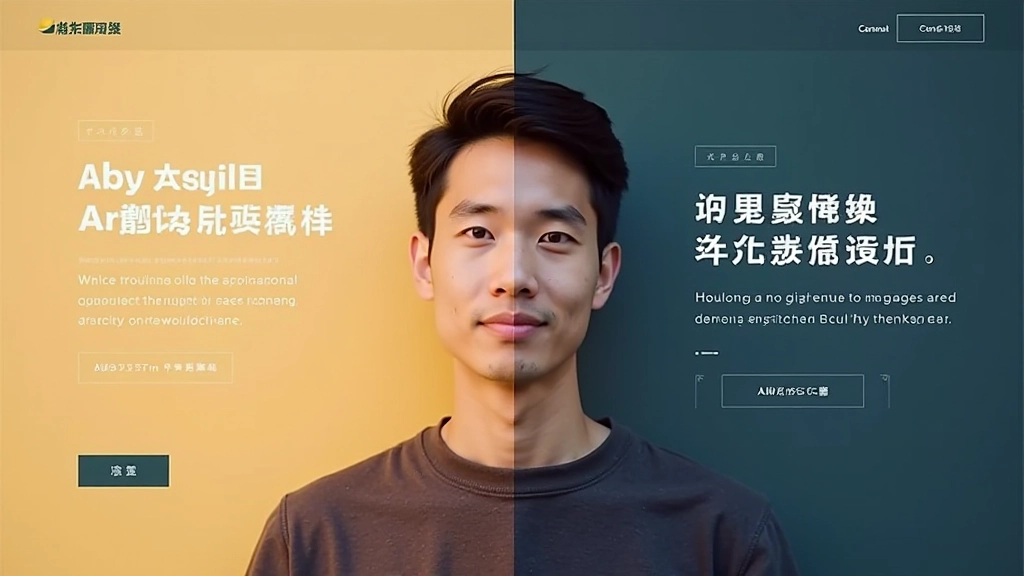
Read ArticleCreate stunning dual-language layouts that divide your message perfectly. English and Traditional Chinese, side by side, responsive and balanced.
The best split-screen design doesn’t choose between English and Chinese—it celebrates both languages as equals. That’s the Hong Kong way.
Learn Our ApproachHong Kong is bilingual. Your designs should be too. A split-screen layout isn’t just aesthetic—it’s functional, respectful, and honestly, it looks sharp when done right. We’ve seen brands connect better with their audience when both languages get equal visual weight.
Whether you’re targeting English speakers, Cantonese readers, or both simultaneously, the split-screen approach lets your message breathe. No awkward text wrapping. No compromises on either language. Just clean, balanced, professional communication.
Five core principles that make the technique actually work.
50/50 split or asymmetric—the math matters. You’re not just cutting the screen in half. You’re creating balance between two equally important content streams.
English and Traditional Chinese have different x-heights and stroke weights. Font sizing, line-height, letter-spacing—these details make or break readability on both sides.
On mobile, your split becomes a stack. The order matters. Which language shows first? How do you maintain visual hierarchy when space is tight?
One side is an image, the other is text? Or both text with different languages? The weight distribution between your two blocks keeps everything feeling intentional.
When text sits next to each other in different languages, color contrast becomes crucial. You need enough separation so neither language overpowers the other visually.
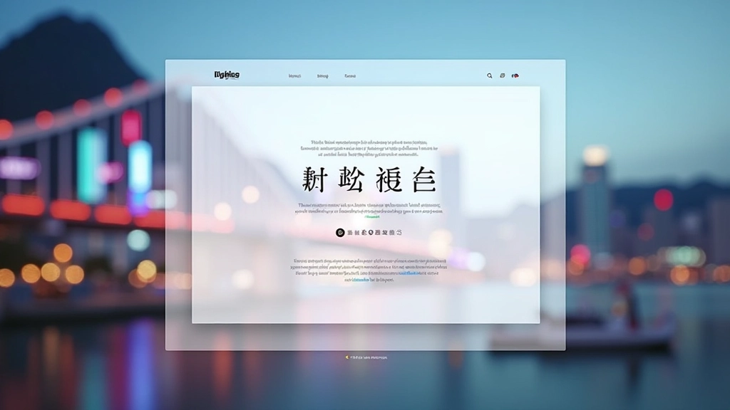
Our comprehensive resource library on split-screen design.
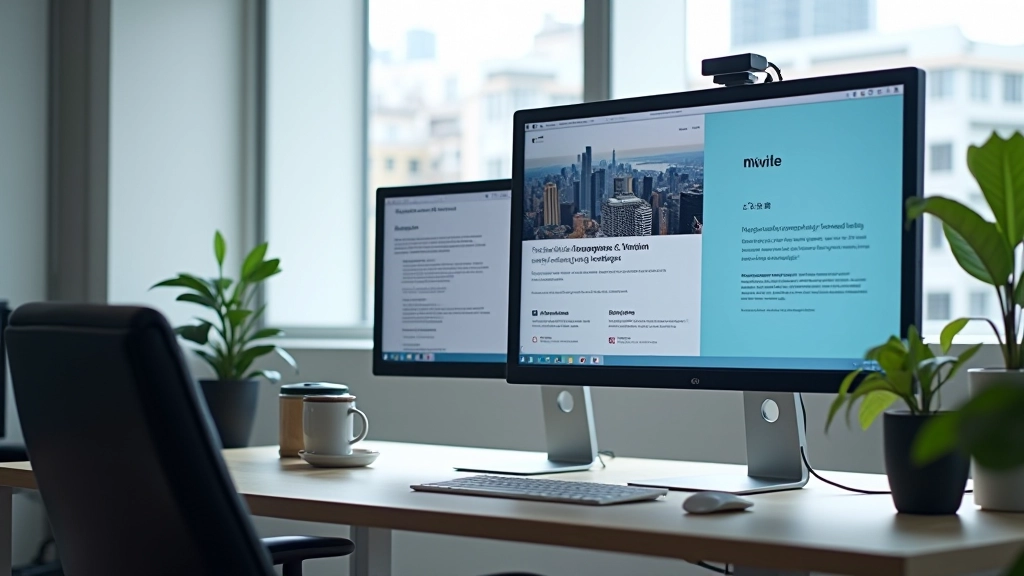
Wasn’t sure how to handle two languages on the same page without it looking cluttered. Then I saw how split-screen actually forces you to be cleaner with your design. Everything’s more intentional now. The responsive collapse on mobile took some work but once I got it right, the whole thing just flows.
Start with these. They cover the fundamentals.
Step-by-step walkthrough of creating a basic 50/50 split with HTML and CSS. We’ll cover flexbox techniques that actually work.
Read Article
How to transition a 50/50 split into a single column layout. Media queries, breakpoints, and the order of content matter here.
Read Article
Font pairing, sizing, and line-height considerations when combining English and Traditional Chinese. Common mistakes and how to fix them.
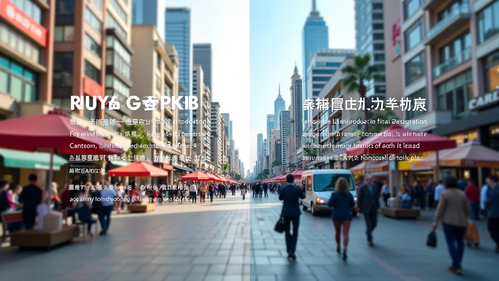
Read ArticleReal layouts that balance English and Traditional Chinese beautifully.