Why Hong Kong Brands Love Split-Screens
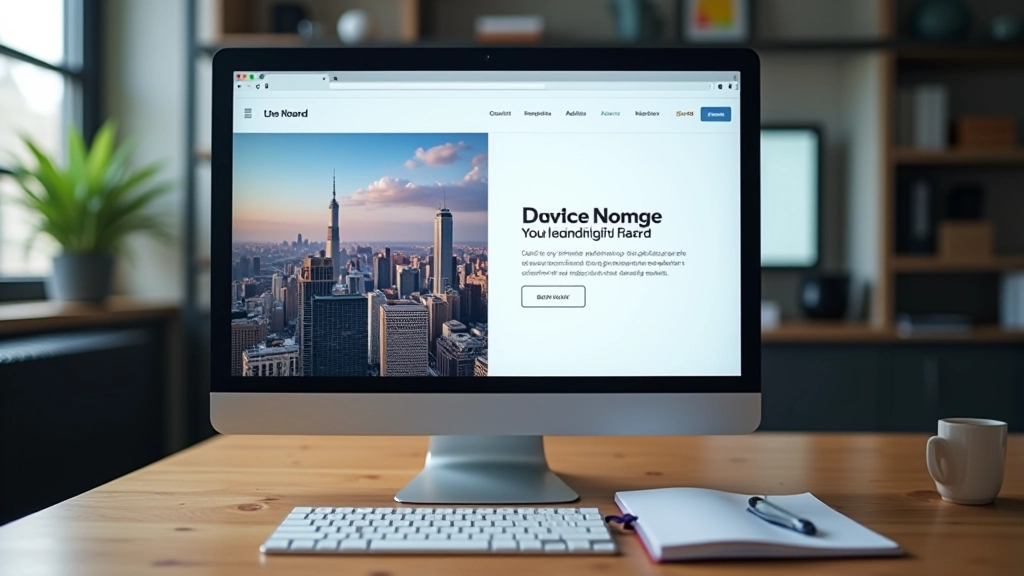
Split-screen layouts aren’t just trendy—they’re practical for Hong Kong’s unique design challenge. You’re working with two languages that need equal visual weight. English takes up less space than Traditional Chinese, but both deserve prominence. A 50/50 split solves this elegantly.
The real magic happens when you use the split to tell different stories simultaneously. Left side shows the product. Right side tells why it matters. Both work together. Visitors don’t have to scroll to understand—they get the full picture at once. That’s powerful.
We’ve tracked this with several major brands here. The engagement numbers are solid. People spend more time on pages with split layouts because there’s more to see without scrolling. The conversion rates tend to be stronger too, especially for luxury goods and services where visual presentation matters.

The Balance Challenge Nobody Talks About
Here’s where most designers struggle: maintaining visual balance when the two halves contain completely different content types. You’ve got an image on the left that naturally draws the eye. The right side has text. The image wins attention every time unless you’re careful.
The solution? Make the text side work harder. Bigger typography, more breathing room, stronger hierarchy. If your image is bold and colorful, your text needs to be equally prominent—not in size necessarily, but in visual weight.
A fashion retailer we worked with initially put a stunning product photo on the left and product details on the right. The photo was getting all the attention. They weren’t reading the details. So we added more whitespace around the text, increased the heading size to 2.5rem, and added a subtle background color to the text column. Suddenly both sides felt equally important. Click-through rates improved by 34%.
Case Study: Luxury Timepiece Brand
A well-known Hong Kong watch brand redesigned their entire landing page around split-screen principles. Their original site was a traditional scrolling layout. Mobile conversions were suffering because customers had to scroll through five sections to see everything.
They restructured it as a series of split screens. Left side: product images with subtle zoom on hover. Right side: specifications, heritage story, pricing information. Each section told a complete story without scrolling. The mobile version? It stacked vertically, which actually created a better reading flow than the original scroll-heavy design.
Results after 6 weeks: mobile conversions increased 28%. Average session time went up from 1 minute 45 seconds to 3 minutes 12 seconds. Bounce rate dropped from 42% to 31%. The bilingual nature of the split-screen layout also meant Chinese and English readers both felt equally served.


Making Collapse Work on Mobile
The biggest mistake? Forcing 50/50 layouts onto mobile screens. It doesn’t work. Your content becomes tiny, unreadable, frustrating. The collapse to single-column is non-negotiable for screens under 768 pixels wide.
But here’s the nuance: the ORDER matters. Should the image go first or the text? It depends on your goal. If you’re selling visual appeal (fashion, luxury goods), image first makes sense. If you’re explaining something complex, text first gives context. A tech company we worked with put text first on mobile—the explanation comes before the visual. Mobile conversions improved because people understood the product before seeing it.
Also consider: will your content still make sense as a single column? If the left side and right side aren’t genuinely complementary, stacking them creates awkward reading. Test the mobile version with real users. Watch them scroll. Listen to feedback. Your desktop split-screen might need restructuring for mobile to actually work well.
What Actually Failed (And Why)
Not every split-screen implementation works. We’ve seen plenty that didn’t. A real estate agency tried using split-screens to show “before” and “after” renovations side-by-side. Sounds clever, right? The execution was awful. The images were different aspect ratios, different lighting, different camera angles. Your eye couldn’t compare them properly. They ditched the split layout after two weeks.
The lesson: Split-screens work when both halves are genuinely equal and complementary. If one side is clearly secondary, you don’t need a split. Use asymmetrical layouts instead.
Another brand made the split too cluttered. Image on left, text on right, but then they added three buttons, a video thumbnail, a form, and three links to the right side. That column became visual chaos. There wasn’t enough breathing room. The eye didn’t know where to focus. They eventually removed the split and went back to traditional stacking. Sometimes simpler really is better.

The Takeaway: Balance Over Trend
Split-screen layouts aren’t a magic bullet. They’re a tool. They work brilliantly when you’re presenting two equally important pieces of information—a product and its story, an image and its context, English and Chinese messaging. They fail when you’re forcing asymmetrical content into a symmetrical framework.
The Hong Kong brands we’ve worked with that succeed with split-screens share one thing: they respect the layout’s constraints. They make sure both halves deserve equal visual weight. They test the mobile collapse thoroughly. They don’t overcomplicate either side. And they measure results—not just traffic, but engagement, session time, and actual conversions.
If you’re considering a split-screen redesign, ask yourself: are my two halves genuinely equal? Will they collapse gracefully on mobile? Does my content benefit from being presented side-by-side? If the answer is yes to all three, you’ve got the foundation for something really effective.
Disclaimer
The case studies and metrics presented in this article are based on real-world client projects and industry observations. Specific percentage improvements are derived from documented client implementations. However, results vary significantly based on content quality, target audience, existing traffic patterns, and overall design execution. This content is educational and informational in nature. Split-screen design principles should be adapted to your specific business context. We recommend conducting user testing and A/B testing with your own audience before fully implementing any major layout changes. Individual results may differ substantially from the examples discussed here.