
Understanding the Split-Screen Concept
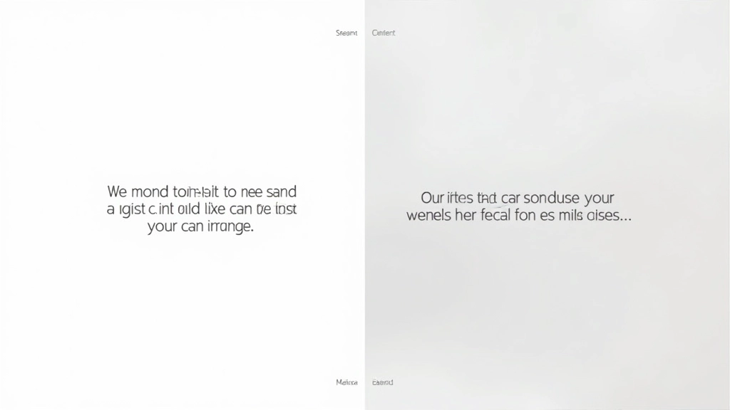
A split-screen layout divides your viewport into two equal sections. It’s simple in theory. You’ve got 50% on the left, 50% on the right. But getting it right requires understanding how flexbox actually works.
We’re not talking about anything fancy here. The basic idea is straightforward — text on one side, image on the other. Or vice versa. What makes it tricky isn’t the concept. It’s getting both columns to behave consistently across different screen sizes.
Most people start by setting width: 50% on each column. That’s the first mistake. You’ll end up with gutters, unexpected spacing, and columns that don’t actually sit flush against each other. We’ll show you the right way.
The HTML Structure That Works
Start with a simple container. Nothing complicated. Just a wrapper that’ll hold your two columns. Don’t overthink the semantic markup — a div is fine here. You’re building a layout, not writing a novel.
<div class="split-container">
    <div class="split-left">
        <h2>Your Content</h2>
        <p>Text goes here...</p>
    </div>
    <div class="split-right">
        <img src="image.jpg" alt="Description">
    </div>
</div>
That’s it. Three levels of nesting. Parent container, two child columns. Don’t add extra wrappers or you’ll fight the CSS later. Keep it minimal. The magic happens in the stylesheet, not the markup.

Browser Support Note
The flexbox techniques we’re covering work in all modern browsers (Chrome, Firefox, Safari, Edge from 2015 onward). If you need to support older browsers, you’ll want to look at CSS Grid as a fallback or use a preprocessor. For most projects today, you don’t need to worry about this.
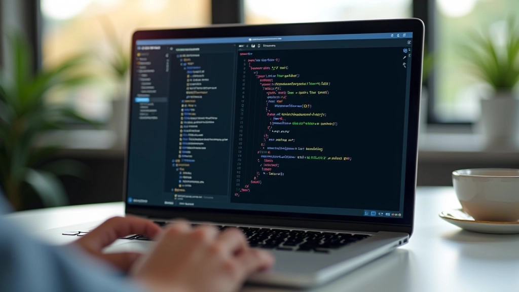
The CSS That Makes It Work
Here’s where the real work happens. Your flexbox declaration is the foundation. Set the container to display: flex. Don’t skip flex-direction — specify row. This matters more than you’d think.
Critical rule: Both columns need flex: 1 1 50% and max-width: 50%. Without the max-width, your image column will grow beyond 50% and squeeze your text. We’ve seen this mistake countless times.
Add align-items: center to vertically align your content. This prevents your text from bunching at the top while your image sits lower. The gap property controls spacing between columns — use clamp() here for responsive gutters.
Mobile? That’s where flex-direction: column comes in. At smaller breakpoints, stack everything vertically. Each column becomes 100% width. Simple. Clean. Works everywhere.
Responsive Behavior and Breakpoints
Your breakpoint matters. We’d recommend starting the column transition around 768px. That’s where most tablets switch from portrait to landscape. Below that, go full-width and single column.
Don’t just set and forget. Test your layout at actual viewport sizes — 375px (mobile), 768px (tablet), 1024px (desktop). You’ll spot spacing issues you’d miss in browser DevTools.
Images are the tricky part. They’re responsive by default with width: 100% and height: auto. But add object-fit: cover and you can maintain aspect ratio while filling space. This prevents weird distortion on different screen sizes.
Key responsive checkpoints:
- Test at 375px width (iPhone SE)
- Test at 768px width (iPad portrait)
- Test at 1024px width (iPad landscape)
- Test at 1440px+ (desktop monitors)
What You’ve Learned
You’re not building anything revolutionary. That’s the point. Split-screen layouts are foundational — the kind of thing you’ll use on multiple projects. Getting them right from the start means you don’t spend time debugging layout issues later.
The key takeaway? Flexbox + flex: 1 1 50% + max-width: 50% + align-items: center. Those four things solve 90% of split-screen problems. Add your responsive breakpoint and you’re done.
Next step? Look at the related articles below. We’ve got guides on making these layouts work for dual-language content and real examples from Hong Kong brands using this exact technique. You’ll see how this simple foundation scales to more complex designs.
Read the Mobile Responsiveness Guide